| Comments display panel
Catalin
Zarejestrowany użytkownik
49 komentarzy
|

|
|
 |
14 czerwca 2009 20:20
Quote
Reply
Using CS on regularly basis, I accumulated plenty of comments to be associated both with the single items and also with countries. I find the feature very useful and I type in all kind of comments that I consider necessary for traking my collectibles. Unfortunately, a quick review of these comments is not very fortunate, since the raw 'comments' displays only the first couple of words on a single line in the main table. To review the comments, you need to double click the respective object, then select the 'comments' tab => three clicks! (for large collections, searching specific items by reading the comments can take very long time).
I was thinking therefore about a solution to enhance the respective feature and my suggestion is to make use of the available space and alternatively display the 'comments' field in a separate panel. One possible location would be on the left, just below the collection tree. Since the content of the panel (window) is just plain text, it might be perhaps not very difficult to extract the content from the 'comments' field and simply display it on the left when the respective line is being selected.
The panel can be shown or hidden in the same way as the collection tree (small 'x' in the top-right section of the panel and also from the main 'View' menu) so the users who don't need this extra feature can just disable it and use the software just as they are used to.
I would be very grateful for such enhancement and also like to hear your oppinion on this suggestion.
Many thanks,
Catalin
|
 |
 |
|
Using CS on regularly basis, I accumulated plenty of comments to be associated both with the single items and also with countries. I find the feature very useful and I type in all kind of comments that I consider necessary for traking my collectibles. Unfortunately, a quick review of these comments is not very fortunate, since the raw 'comments' displays only the first couple of words on a single line in the main table. To review the comments, you need to double click the respective object, then select the 'comments' tab => three clicks! (for large collections, searching specific items by reading the comments can take very long time).
I was thinking therefore about a solution to enhance the respective feature and my suggestion is to make use of the available space and alternatively display the 'comments' field in a separate panel. One possible location would be on the left, just below the collection tree. Since the content of the panel (window) is just plain text, it might be perhaps not very difficult to extract the content from the 'comments' field and simply display it on the left when the respective line is being selected.
The panel can be shown or hidden in the same way as the collection tree (small 'x' in the top-right section of the panel and also from the main 'View' menu) so the users who don't need this extra feature can just disable it and use the software just as they are used to.
I would be very grateful for such enhancement and also like to hear your oppinion on this suggestion.
Many thanks,
Catalin
|
|
| |
 |
+0
-0
|
 |
|
|
serge
Grupa deweloperska
189 komentarzy
|

|
|
 |
16 czerwca 2009 08:15
last modified on 16 czerwca 2009 08:17
Quote
Reply
Generally, it will be very good to have a faster access on collectibles comments during browsing in the list. You are right. But we think it will be better, if CollectionStudio will have [i]Edit[/i] dialog without modal window style, it means that you can select another collectible in the list using your mouse without closing [i]Edit[/i] dialog, therefor you will have the same tab active on it for just selected collectible. Having this feature done, we will resolve your usability request about work with comments.
From other side, talking about a new panel with the same usability style as was implemented for [i]Collection Tree[/i] panel, we want to enhance [i]View Using[/i] tool. Having selected an appropriate template to show the collectible you can setup your own, special view which will fit you demands. But, also it should have non modal window style in order to easy switch between collectibles.
So, I hope, in the nearest future we will have two main modes to work with collectible:
1. [i]Edit[/i] window - tool for convenient modification of the collectible data;
2. [i]View Using[/i] tool - window for comfortable viewing of the collectible data (with user setup possibility using modification or creation of the new viewing templates).
|
 |
 |
|
Generally, it will be very good to have a faster access on collectibles comments during browsing in the list. You are right. But we think it will be better, if CollectionStudio will have Edit dialog without modal window style, it means that you can select another collectible in the list using your mouse without closing Edit dialog, therefor you will have the same tab active on it for just selected collectible. Having this feature done, we will resolve your usability request about work with comments.
From other side, talking about a new panel with the same usability style as was implemented for Collection Tree panel, we want to enhance View Using tool. Having selected an appropriate template to show the collectible you can setup your own, special view which will fit you demands. But, also it should have non modal window style in order to easy switch between collectibles.
So, I hope, in the nearest future we will have two main modes to work with collectible:
1. Edit window - tool for convenient modification of the collectible data;
2. View Using tool - window for comfortable viewing of the collectible data (with user setup possibility using modification or creation of the new viewing templates).
|
|
| |
 |
+0
-0
|
 |
|
|
Catalin
Zarejestrowany użytkownik
49 komentarzy
|

|
|
 |
24 czerwca 2009 07:31
Quote
Reply
That's great, I think the [i]View using[/i] tool would work that out very well, especially with custom user setup (one may, for instance, select only the 'comments' field to be displayed and thus my request would be completely answered).
Thank you Serge!
|
 |
 |
|
That's great, I think the View using tool would work that out very well, especially with custom user setup (one may, for instance, select only the 'comments' field to be displayed and thus my request would be completely answered).
Thank you Serge!
|
|
| |
 |
+0
-0
|
 |
|
|
serge
Grupa deweloperska
189 komentarzy
|

|
|
 |
24 lipca 2009 08:46
Quote
Reply
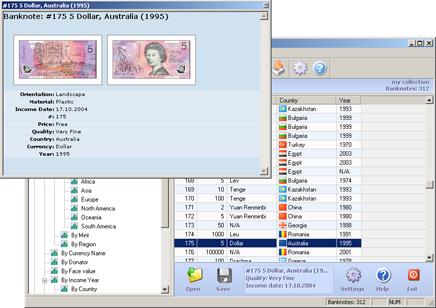
With newer version CS355 (which is released some minutes ago), we have new look of the [i]View using[/i] tool and what is most important - a new behavior of that tool: now you can switch between collectibles in the main list using keyboard cursors and/or mouse without closing [i]View using[/i] tool window:
[url=/images/messages/cs355/view_using_tool/view_using_large.jpg][img]/images/messages/cs355/view_using_tool/view_using.jpg[/img][/url]
Click on image to enlarge
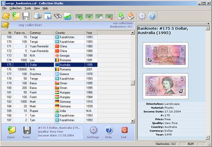
Of course, as it was promised, now you can dock it anywhere for your convenience:
[url=/images/messages/cs355/view_using_tool/view_using_docked_large.jpg][img]/images/messages/cs355/view_using_tool/view_using_docked.jpg[/img][/url]
Click on image to enlarge
|
 |
 |
|
With newer version CS355 (which is released some minutes ago), we have new look of the View using tool and what is most important - a new behavior of that tool: now you can switch between collectibles in the main list using keyboard cursors and/or mouse without closing View using tool window:

Click on image to enlarge
Of course, as it was promised, now you can dock it anywhere for your convenience:

Click on image to enlarge
|
|
| |
 |
+0
-0
|
 |
|
|
Catalin
Zarejestrowany użytkownik
49 komentarzy
|

|
|
 |
18 października 2009 23:41
Quote
Reply
Late comment: the new [i]View using[/i] tool is just wonderful, thank you!!!
:flower:
|
 |
 |
|
Late comment: the new View using tool is just wonderful, thank you!!!

|
|
| |
 |
+0
-0
|
 |
|
|
|